Securitas’ iconic logo – with its three red dots and the name “Securitas” underneath – was registered with the Swedish Patents and Registration Office on May 11, 1973. At the time of registration, the logo had already been in use since 1971, but the registration confirmed Securitas’ ownership of the logo.
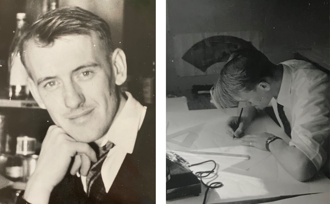
Karl Erik Ekeroth, the artist behind the icon
The logo was designed by Swedish artist Karl Erik Ekeroth (1931-2019). Ekeroth studied art history, lettering, and painting at Konstfack, Sweden’s largest university specializing in art, craft, and design. His idea of using three dots comes from the letter “S” in the morse code, known from the international distress signal SOS.
The use of lowercase letters in logotypes was fashionable in the ’70s, which is why Ekeroth used only lowercase letters for the company name in his original sketches. However, Securitas’ CEO at the time, Erik Philip-Sörensen, preferred uppercase letters, and Ekeroth reluctantly agreed. But he did manage, as a quiet, artistic protest, to squeeze in a lowercase “u”. After the brand update of 2021, only the "S" remained capitalized, with the subsequent letters lowercase – in some ways preserving Ekeroth's artistic expression.
Unchanged since registration
“Securitas’ visual identity has seen two major overhauls,” says Mauro Silva, VP Brand and Strategic Marketing. “But the three red dots have remained almost untouched since registration. They represent our values (integrity, vigilance, and helpfulness), and are our most powerful brand asset and our unmistakable identifier. In February, Securitas was named the 8th most valuable Swedish brand in the world, which shows the power of being true to our legacy, no matter what.”
Over 350,000 employees and millions of people in 45 markets all over the world encounter the three red dots each day. They are found not only outside Securitas offices, but are visible at clients’ sites, and on cars and uniforms, instilling pride in our officers and clients across the globe. The world has changed significantly over the past 50 years, but Securitas remains dedicated to making your world a safer place, while shaping a security solutions provider at the forefront with world-leading technology and expertise.
“The three dots are a constant reminder of our values,” says Helena Andreas, SVP Group Communications and People. “Each day, they help shape the culture of our business, which in turn helps us to create long-term success by providing value to our clients, colleagues, and communities. This commitment, decade after decade, is what has made Securitas the world leading security solutions partner we are today.”
Quick facts
- The first filing of Securitas’ logo was on October 27, 1971
- The logotype is designed by Karl Erik Ekeroth (1931-2019)
- The registration date was May 11, 1973
- The idea of using three red dots comes from the letter “S” in the morse code, known from the international distress signal SOS (▄ ▄ ▄ ▄▄▄ ▄▄▄ ▄▄▄ ▄ ▄ ▄)
- The red colour is Pantone 1787C + 1788U, (C 000, M 092, Y 076, K 000)
- Securitas made the top 10 ranking on Brand Finance’s 2023 annual report on the most valuable and strongest Swedish brands
- The three red dots are also part of the logos for Securitas Technology and Securitas Healthcare
Images
- Portrait of Karl Erik Ekeroth (photo: private)
- Karl Erik Ekeroth, the artist behind Securitas’ logo, at work at his desk (photo: private)


Sign up for our newsletter and get a free risk assessment
* = mandatory fields


